U.S. Department of the Interior
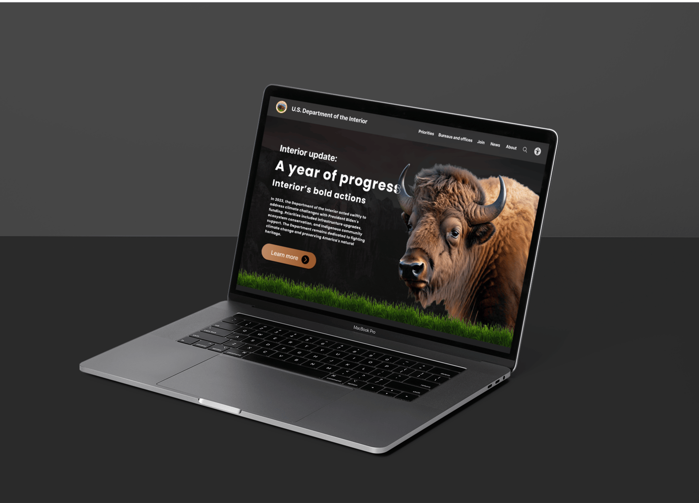
The Department of the Interior manages natural places like national parks and wildlife reserves, manages energy resources, and oversees Native American affairs. Additionally, it helps care for America's land, water, and resources, making sure they're used wisely and protected. This project focuses on redesigning the homepage to enhance user experience and address existing issues.

Research
Define
Ideate
Design
Test
Role
UX/UI designer - I was responsible for structuring a revamp of the homepage and designing a tailored solution.
Purpose
Duration
2 weeks
Tools
Figma, Zoom, Slack, Trello, Google slides.
This project aims to redesign the homepage and address several key issues. The current homepage lacks clear messaging, exhibits uneven spacing, and struggles with effective content chunking. Furthermore, it must adhere to fundamental design principles such as alignment, balance, and emphasis.
Given that the homepage serves as the website's focal point, it is essential to present the most relevant and critical information in a manner that resonates with users' expectations and needs.
Why do we need a redesign?
Interview points
I can't find the purpose and the function of the website.
The information looks cluttered.
I want to join and be a volunteer, but I have to click through a lot of pages to reach it.
The blue color on the navigation bar is making the text difficult to read.
Through extensive user interviews, it became apparent that the department's purpose is not clearly conveyed, leaving visitors uncertain about its functions. Additionally, potential volunteers struggle to locate the join volunteer option, leading to frustration and inefficiency.
Thus, based on the gathered data, it is imperative to overhaul the entire structure of the homepage to address these issues comprehensively. This project aims to enhance clarity, improve user experience, and better align the homepage with the department's objectives and user expectations.
The current website


8 out of 10 users rated their experience on this website as 2 out of 5 stars.
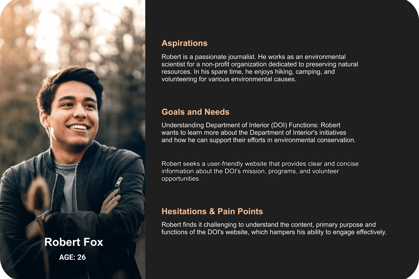
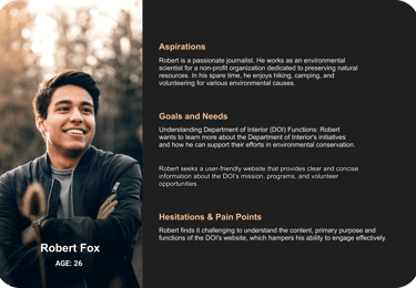
User persona


Users struggle to understand the website's purpose and functions, encountering cluttered information. This lack of clarity leads to frustration and inefficiency, hindering effective engagement with the Department of Interior's online platform.
Problem statement
Solution
Revamp the homepage to align it with the department's objectives and user needs, improving the user experience and fostering intuitive and engaging interactions.
The problem
My approach
Initiate a homepage revamp following the principles of design.
Chunking the information and showcasing most relevant content in the homepage.
Displaying the key functions of the website on the homepage and creating a new structure of organized content.
Style guide
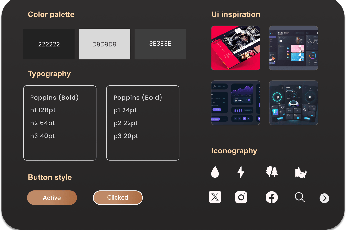
Primary color
I picked Charcoal as the primary color for this website. The inspiration for the charcoal color came from natural textures like tree bark, soil, and rock. This color is often associated with authority, seriousness, and professionalism, which aligns well with the Department of the Interior. Charcoal gives the website a refined look and contrast, enhancing text legibility. It can serve as a versatile backdrop for showcasing vibrant images of landscapes, wildlife, and historical sites managed by the Department of the Interior.
Wireframe
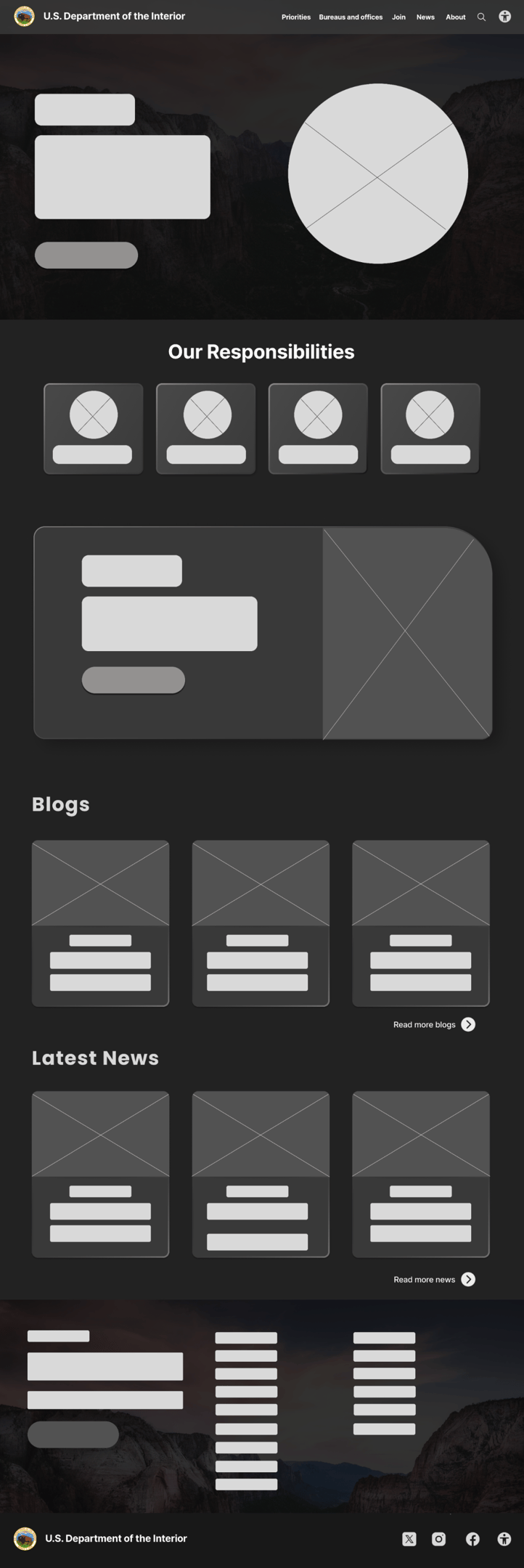
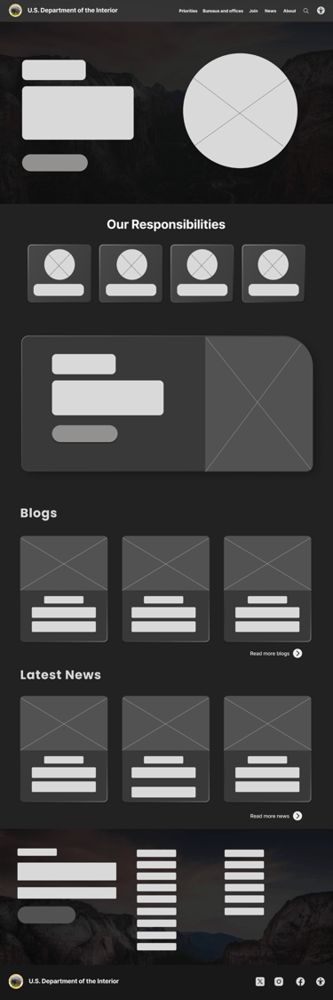
Wireframing helped me to design a visual overview of my idea of where to place content and imagery.
The bison image will be used here, symbolizing the Department of the Interior's commitment to preserving America's wildlife.
This area will be used to explain the duties of the Department of the Interior through text and iconography.
Call to action button for joining the volunteer option.
High fidelity design
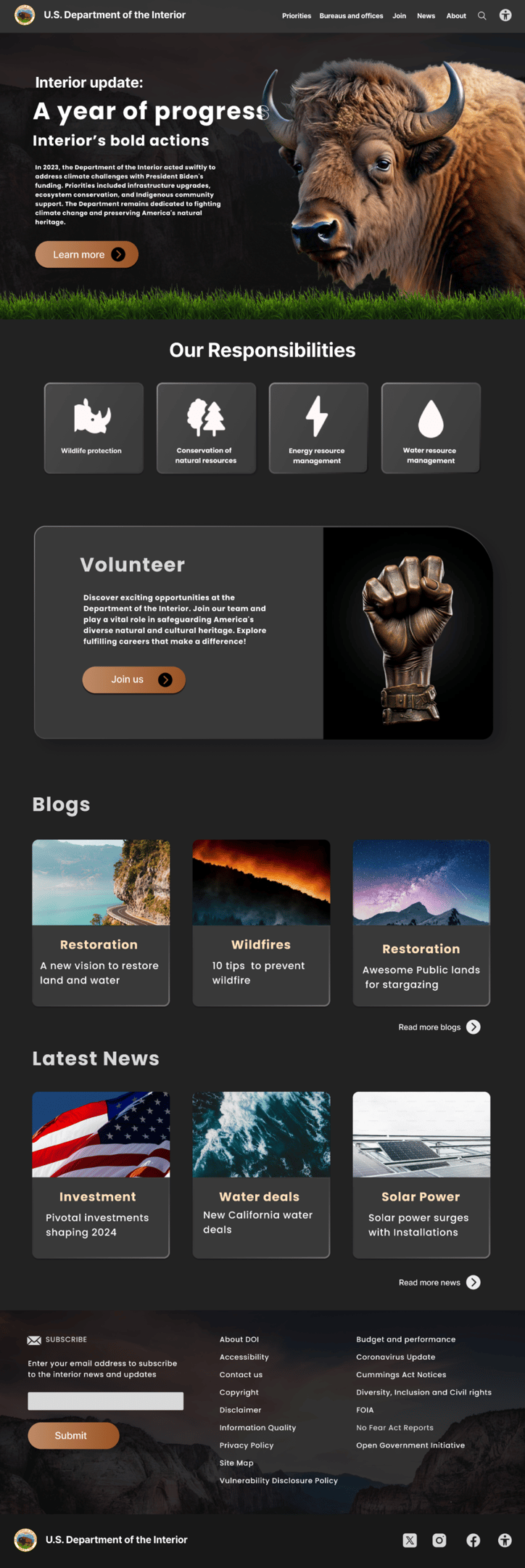
Wireframing helped me to design a visual overview of my idea of where to place content and imagery.

User testing result
After implementing the proposed changes, user testing revealed significant improvements in comprehension and navigation on the Department of the Interior's online platform. Participants reported a clearer understanding of the website's purpose and functions, leading to reduced frustration and increased efficiency. The revamped homepage aligned with the department's objectives and addressed user needs, resulting in a more intuitive and engaging experience.
Additionally, users noted enhanced text legibility with charcoal color, which contributed to improved readability across the platform. The adherence to design principles ensured uniformity and coherence, enhancing the overall user experience. Overall, the user testing results indicated a positive response to the changes, with users expressing greater satisfaction and effectiveness in engaging with the Department of the Interior's online platform.
